


October 13, 2026
Use CMYK for full colour photos and most general print runs. Use Pantone spot inks when you need exact brand colours, fluorescents, metallics, or guaranteed consistency across jobs. Spot inks add setup cost and need physical proofing, which the sections below explain, along with how to match and confirm colour before you commit to a full run.
TL;DR:
- For brochures and business cards combining photography with a logo, print images in CMYK and reserve a spot ink for the logo when budget allows.
- A short run of 50 promotional items rarely justifies extra spot plates, while large recurring merchandise orders can spread setup costs across more units.
- Coated and uncoated materials can change how the same Pantone ink appears, so specify its correct suffix and check a physical proof on that substrate.
- Screens cannot verify color; compare a Pantone swatch with its closest CMYK build using a Colour Bridge guide, and request spectrophotometer readings for tight tolerances.
Table of Contents
- What CMYK is and how process printing reproduces colour
- What Pantone spot colours are and why they print differently
- Gamut, consistency, reproducibility and cost compared
- When to choose each system for common print and merchandise jobs
- How to match Pantone to CMYK and proof it properly
- Preflight checklist to avoid colour surprises on press
- How we handle Pantone matching on branded merchandise
- Clear definitions of CMYK and Pantone
- Balancing colour fidelity and budget
- Get your colours right before you print with PromoShop
- FAQ
- Sources
What CMYK is and how process printing reproduces colour
CMYK stands for cyan, magenta, yellow and black. These four inks lay down tiny dots in overlapping patterns, called halftones, to simulate the full range of colours you see in a photo or a complex graphic. It is the standard for digital and offset printing because it reproduces continuous tone imagery well and keeps costs down for most jobs, as Paperlust explains.
CMYK has a smaller colour gamut than Pantone. Several colour families fall outside what four process inks can reliably reproduce, which is why brand-critical work often moves to spot colour instead.
- Highly saturated oranges and greens often look muted or shifted in CMYK.
- Neon and fluorescent colours cannot be matched with process inks.
- Metallics need actual metallic ink or foil, not a CMYK approximation.
The final result also depends on the press, dot gain on the substrate, paper stock and any coating. A gloss-coated stock holds dot sharpness better than an uncoated stock, so the same file can look different depending on where it is printed.
What Pantone spot colours are and why they print differently
Pantone, formally the Pantone Matching System, assigns a number to each pre-mixed, solid ink formula. Rather than building a colour from four process inks on press, the printer uses the actual mixed ink specified by that number, which is how Pantone achieves consistent, exact colour from job to job, as Paperlust notes.
Substrate matters here too. Most Pantone colours carry a coated © or uncoated (U) suffix, because the same ink formula looks noticeably different depending on the paper or material it sits on.
- Each spot colour runs on its own plate, separate from any process colours in the job.
- Logos and single-colour or two-colour items suit spot printing well.
- Metallics and fluorescents are only reliably available as spot inks.
This is why a brand’s primary logo colour is commonly specified as a Pantone number rather than a CMYK build: the same formula should print consistently whether it is going on a letterhead or a drink bottle.
Gamut, consistency, reproducibility and cost compared
The decision between CMYK and Pantone comes down to four practical factors, and they tend to pull in different directions depending on the job.
- Gamut: CMYK covers most of what a photograph needs but cannot reliably reach the brightest oranges, greens, neons or any metallic finish, while Pantone’s solid inks can, as Paperlust details.
- Consistency: Pantone gives designers and printers a shared numbered language, so the same formula should produce a similar result across different print shops and substrates, which is the main reason brand managers justify the extra cost.
- Cost and time: Spot colour means an extra plate and a mixed ink for every Pantone used, which adds setup time and per-unit cost compared with a standard four-colour process run.
- Extended gamut options: Adding extra inks, such as orange, green and violet, to a base CMYK set can simulate a wider range of Pantone colours without running full spot inks, an approach Wikipedia’s overview of Pantone describes as a middle ground between the two systems.
None of this makes one system better overall. A photo-heavy brochure gains nothing from spot inks and would only pick up unnecessary cost. A single-colour logo on an uncoated tote bag, on the other hand, can shift noticeably if it is left to a CMYK build rather than a specified Pantone formula. The right call depends on what is actually on the page and how much that specific colour needs to match everywhere else your brand appears.
When to choose each system for common print and merchandise jobs
A few rules of thumb cover most decisions designers and print buyers face.
- Choose Pantone whenever a logo or brand colour has to match exactly across multiple items or vendors, since that consistency is the entire point of the system.
- Choose CMYK for photo-rich pieces, like brochures or packaging with product imagery, where subtle colour shifts are not noticeable and lower per-unit cost matters more.
- For business cards and brochures with a logo plus photography, consider a hybrid: CMYK for the imagery, a spot colour for the logo if budget allows.
- For apparel, the imprint method changes the answer: screen printing can run exact Pantone spot inks per colour, while digital transfer methods typically mimic colour using process builds.
- For drinkware, bag tags, flags and similar promotional items, pad printing and screen printing again favour Pantone for brand fidelity, while full colour digital wraps lean on CMYK or extended gamut reproduction.
- Weigh run length against the decision too: a short run of 50 items rarely justifies the setup cost of extra spot plates, while a large, ongoing order of branded merchandise often does.
Budget and substrate matter as much as the artwork itself. A fluorescent safety colour or a metallic finish simply is not available in CMYK, so that choice is made for you before cost even enters the conversation.
How to match Pantone to CMYK and proof it properly
Converting a Pantone colour to CMYK always involves some compromise, so the goal is to know in advance how close that compromise will be, not to guess after printing.
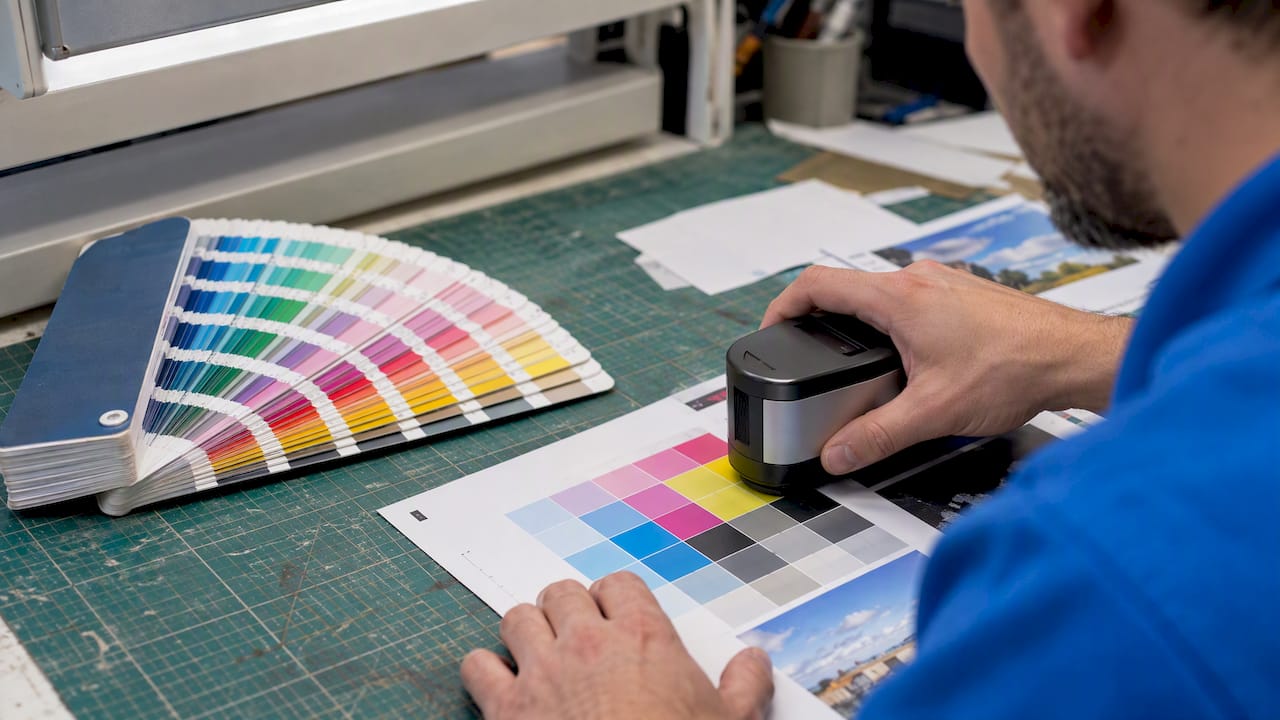
- Compare the solid Pantone swatch against its closest CMYK build using a physical Pantone Colour Bridge guide, never a screen.
- Set your document’s colour profile correctly and embed the right ICC profile for printing before sending files to print.
- Specify Pantone colours as spot channels in your file rather than converting them to CMYK values yourself.
- Note the correct coated or uncoated suffix for your chosen Pantone, since the same number reads differently on each substrate.
- Request a physical proof, and for tight-tolerance brand work, ask for a spectrophotometer reading rather than relying on a visual check alone.
Monitors display colour in RGB light, so an on-screen match tells you very little about what will come off a CMYK or spot-ink press, a point raised clearly in TshirtPlus’s guide to RGB vs CMYK for custom apparel. Australian pre-press training units ICPPRP4300 build this same discipline into industry practice, specifying calibration, ICC profile use and spectrophotometric checks as standard steps before a job goes to full production.
Pro Tip: Always check your proof under standard, consistent lighting, because the same printed colour can look different under warm office light than it does under daylight.
Spectrophotometer readings against a Pantone Colour Bridge swatch are the benchmark printers use to confirm a CMYK build is close enough to a target Pantone, a method Pantone Australia recommends for setting realistic expectations before a full run.
When a colour is genuinely brand-critical, ask your printer directly for spot ink rather than a process mimic, and put the Pantone number, substrate suffix and any tolerance notes in your job file so nothing gets left to assumption.
Preflight checklist to avoid colour surprises on press
A short checklist before a job goes to print saves far more time than fixing a colour problem after the fact.
- Confirm the colour space used throughout the file and embed the correct ICC profile.
- List every Pantone number used, with its coated or uncoated suffix, directly in the job notes.
- Request a physical proof rather than approving from a PDF or screen.
- Check imposition and colour separations before the file is sent to plate.
- Confirm ink limits and total ink coverage suit the substrate, particularly on uncoated or textured stock.
The imprint method on promotional merchandise changes what is possible here. Screen printing and pad printing both handle true spot inks well, which is why they remain common for logo-heavy items, while DTG (direct-to-garment) printing builds colour from a process style gamut and suits full colour or photographic designs better than exact spot matching.
Pro Tip: Agree on a colour tolerance and turnaround expectation with your supplier up front, in writing, so a minor shift on press does not turn into a dispute after the goods arrive.
How we handle Pantone matching on branded merchandise
With extensive experience in branded merchandise, we work through Pantone matching as a standard part of preparing artwork for production, not an optional extra. Our Pantone colour matching process pairs physical swatches against the substrate going to print, rather than relying on a screen preview, before any order is confirmed.
A brand-critical colour gets checked early, without slowing down turnaround, and there are services to support this. For drink bottles, bags, flags and apparel, we match imprint method to the job: screen and pad printing for exact spot colours, process builds for photo-rich or multi-colour designs, following the same approach outlined in our branding guide.
Clear definitions of CMYK and Pantone
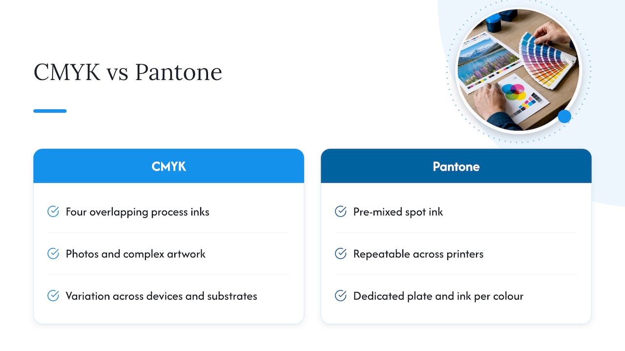
CMYK is a process colour model. It builds images from four inks (cyan, magenta, yellow and black) printed as overlapping dot patterns, which the eye blends into continuous tone. It is the standard model behind most digital and offset printing because it reproduces photography and complex multi-colour artwork efficiently, as Paperlust’s overview sets out.
Pantone, or the Pantone Matching System (PMS), is a spot colour system. Instead of building a colour from four inks on press, each Pantone number refers to a specific pre-mixed ink formula, printed as a single solid colour. That formula is documented so it can be reproduced the same way by different printers in different locations, which Pantone Australia describes as a standardised language for specifying colour across industries and substrates.
The practical difference comes down to how the colour is made. CMYK simulates colour through a mix of four inks and works well when some variation between devices and substrates is acceptable. Pantone specifies the actual ink, which removes that variation for the colours it covers, at the cost of needing a dedicated plate and ink for each one used.
Balancing colour fidelity and budget
The costly mistake I see most often is treating every colour in a design as equally important. It rarely is. Reserve Pantone spot inks for the one or two colours that genuinely carry your brand, such as a logo mark, and let CMYK handle everything else.
Test early. A quick proof against a Pantone Colour Bridge swatch, checked before a full run, costs far less than reprinting a batch of branded merchandise because a colour shifted on an uncoated bag versus a coated catalogue.
— PromoShop
Get your colours right before you print with PromoShop
Getting Pantone and CMYK right on promotional merchandise comes down to catching colour issues before the full run, not after. There are services available such as Pantone colour matching and artwork design to help ensure brand-critical colours are checked properly without adding delay or guesswork to orders.
- Pantone colour matching against your chosen substrate before production begins.
- Free artwork design to set up spot channels and CMYK builds correctly from the start.
- Express service when turnaround matters as much as colour accuracy.
If you are ready to lock in colour for drink bottles, bags, car flags or apparel, start with our custom branding page or browse the full range of promotional products to request a proof and quote.
FAQ
How do I match a Pantone colour to CMYK?
Compare the solid Pantone swatch against its closest CMYK build using a physical Pantone Colour Bridge guide rather than trusting a screen preview. For brand-critical colours, confirm the approximation with a physical proof before approving a full run.
What is the difference between RGB and CMYK printing?
RGB is a light-based colour model used by screens, while CMYK is an ink-based model used for most digital and offset printing. Because monitors display RGB, an on-screen colour will not accurately predict a printed CMYK result, which is why designers are advised to preview in CMYK and check physical proofs, as TshirtPlus explains.
What is Pantone used for?
Pantone is used for brand colours, logos and any design element where exact, repeatable colour matters across different printers and substrates. It is also the standard choice for metallics and fluorescent colours, which CMYK cannot reliably reproduce.
What colours does CMYK struggle with?
CMYK struggles most with highly saturated oranges and greens, neon or fluorescent colours, and any metallic finish. These generally require Pantone spot inks or a metallic ink to reproduce accurately, as Paperlust notes.
Does paper stock affect Pantone colour?
Yes, the same Pantone ink can look different on coated versus uncoated stock, which is why most Pantone colours carry a C or U suffix. Checking a physical swatch on the exact substrate planned for production helps avoid an unexpected colour shift.
Sources
- Pantone vs CMYK: Spot colour guidance (Paperlust)
- Training
- RGB vs CMYK for custom clothing (TshirtPlus blog)