


September 22, 2026
The fastest route to an approved Pantone match starts with Pantone Connect or the Pantone Color Finder to shortlist candidate numbers from your RGB, HEX or CMYK values, then locks in that choice against a physical guide or an agreed press proof. Decide upfront whether the job runs on spot ink or a CMYK approximation, because that decision changes what the printer needs from you. Skip the physical check and you’re gambling on a screen.
TL;DR:
- Using the original artwork file with correct colour space information ensures accurate Pantone matching, avoiding common errors from guessing source values.
- Shortlisting multiple Pantone options before final approval reduces the risk of mismatched colours and unnecessary reprints, saving time and costs.
- Including full specifications such as colour number, suffix, substrate, finish, and print method in the brief prevents production errors caused by incomplete instructions.
- Verification with physical Pantone guides or proofs remains essential, as on-screen simulations and device scans can distort actual colours.
- Clearly documenting the chosen method, such as spot ink or CMYK, and attaching full specifications to each job helps maintain colour consistency across multiple runs.
Table of Contents
- What Pantone tools designers actually rely on
- Capturing a colour digitally: the Match Card and its limits
- The step-by-step workflow from file to approved print
- Spot colour versus CMYK for brand and promo production
- Checks and pitfalls that stop colour failures before they happen
- Why colour discipline matters more on merchandise than anywhere else
- Getting Pantone-accurate merchandise made without the guesswork
- Where to check the technical detail yourself
- Sources
- FAQ
What Pantone tools designers actually rely on
Pantone runs two separate systems, and mixing them up wastes time. The PMS (Pantone Matching System) covers graphics, packaging and print. FHI (Fashion, Home + Interiors) covers textiles, plastics and coatings, including most branded apparel and merchandise. If you’re colour matching a printed logo, you want PMS. If you’re matching a garment or a moulded product, FHI is the relevant library.
For digital identification, Pantone Connect Basic is free once you create an account, and it gives you access to more than 15,000 colours along with search, pick and measure tools, plus up to ten saved palettes. That’s enough for most designers hunting for a starting reference. Pantone Connect Premium adds the Adobe Creative Cloud plugin, letting you pull the full library straight into Illustrator or Photoshop, along with sharper conversion tools between colour spaces.
The Pantone Color Finder works well as a quick browser lookup, but it’s not a substitute for the physical Formula Guide or Color Bridge, which remain the actual production reference. Here’s what each tool covers:
- Pantone Connect Basic: free search, pick, measure, ten saved palettes
- Pantone Connect Premium: adds Adobe integration and conversion tools
- Pantone Color Finder: fast web lookup for browsing candidates
- Physical Formula Guide / Color Bridge: the actual production standard
Pantone itself warns that on-screen simulations may not accurately represent physical Pantone Colour Standards, which is why every candidate needs verification before it goes anywhere near a print run.
Capturing a colour digitally: the Match Card and its limits
Start with the original file, never a photo of a screen. Open the artwork, select the exact swatch, and check what colour space it’s actually built in. RGB, HEX, CMYK and Lab values all point to different Pantone equivalents, and guessing the wrong source space is one of the most common matching errors.
- Isolate the swatch in your design software and note its exact value (RGB, HEX, CMYK or Lab)
- Open Pantone Connect and use the pick or measure tool to generate candidate Pantone numbers
- If you’re inside Adobe, use the Connect Premium plugin to pull the library directly into your file
- For physical objects, use the Pantone Color Match Card with the Connect mobile app
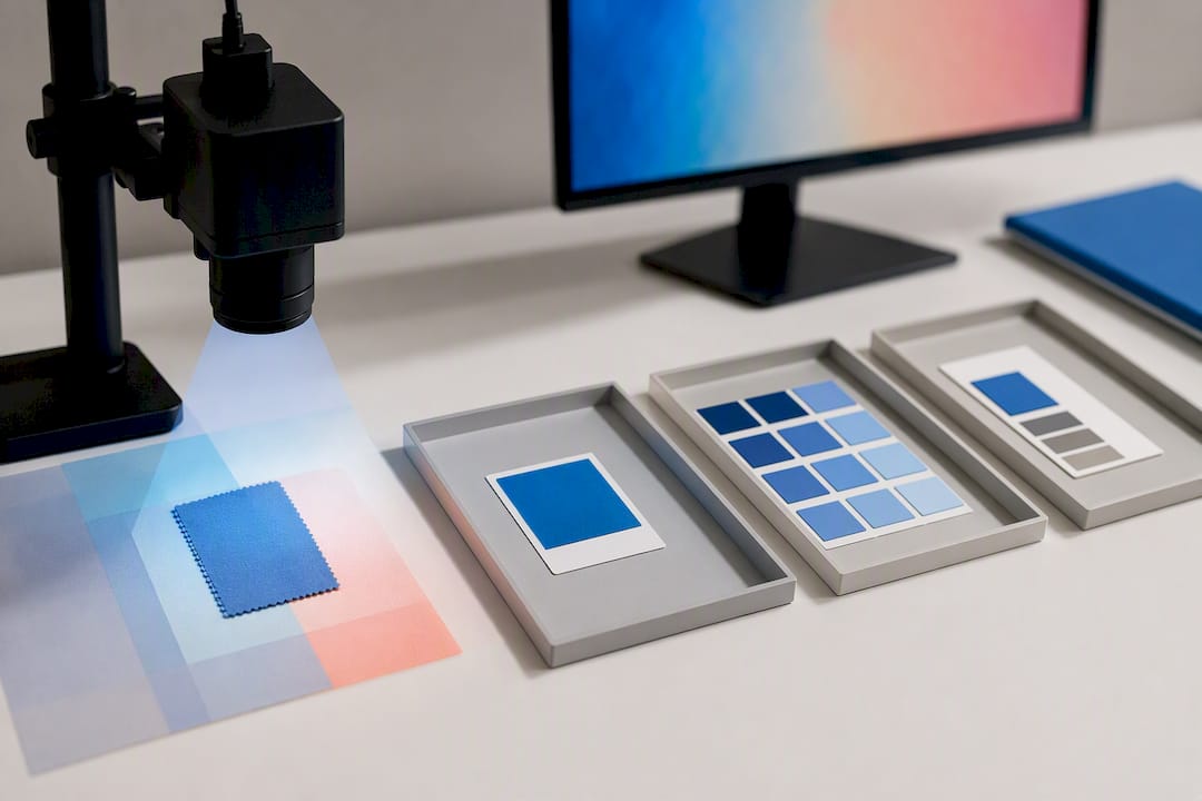
The Match Card places a reference swatch alongside the sample so your phone’s camera can compare and suggest a closer Pantone number, but device compatibility matters. Measure functions built into the app may not support phone models produced after 2022, so check your device against Pantone’s compatibility notes before relying on it for a client job.
Pro Tip: Test your phone against a known Pantone chip before you trust it on a live job. Lighting, camera calibration and even a scratched lens can shift the reading enough to send you chasing the wrong number.
A photograph is a weak measurement on its own. White balance, exposure and even the colours sitting near the sample all distort what the camera records, so treat any digital capture, whether from a file or a Match Card scan, as a shortlist generator, not a final answer.
The step-by-step workflow from file to approved print
Getting from a rough colour idea to a signed-off print job follows a fairly fixed sequence, and skipping steps is exactly how mismatched merchandise ends up back in the warehouse.
- Start with the original artwork or a calibrated measurement. Never work from a screenshot, a photo of someone’s monitor, or a printed proof that’s already faded.
- Identify the source colour space. Note whether the value came from RGB, HEX, CMYK or Lab, because the conversion path to Pantone differs for each.
- Generate candidates with Pantone Connect or the Color Finder. Shortlist two or three close numbers rather than locking onto the first result.
- Record the full specification. That means the Pantone number, the suffix (C, U or TCX), the edition, the substrate, the finish and the intended print method. A number without a suffix is an incomplete instruction.
- Decide spot ink or CMYK and state it in the job notes. This isn’t a detail to leave implicit; write it into the brief every time.
- Order a press or contract proof on the actual substrate. Approve that proof under standard lighting before the job goes into full production.
This sequence mirrors how Adobe frames the spot versus process colour decision: the printing method you choose upstream determines exactly what information the printer needs downstream. Miss step four and even a perfect Pantone match on screen can print wrong, because the printer doesn’t know if you meant the coated or uncoated version.
Spot colour versus CMYK for brand and promo production
Spot ink is a premixed colour applied as a single pass, and it earns its place on anything brand critical. It’s repeatable across print runs, holds saturation better than CMYK, and it’s the only realistic way to get metallics, fluorescents or a clean solid on a dark substrate like navy fabric or black plastic.
CMYK builds colour from four process inks layered together, which suits photography and multi-colour artwork where exact brand fidelity matters less than range and cost. Digital CMYK runs are also faster and cheaper for short jobs.
- Choose spot ink for logos, brand-critical colours, metallics, fluorescents and dark substrates
- Choose CMYK for photographic content, gradient-heavy artwork or high colour-count jobs on tighter budgets
- Document the choice explicitly, printers don’t guess, they follow whatever’s written on the job ticket
For screen printing on apparel, drink bottles or bag tags, that written instruction is what stops a supplier defaulting to their nearest in-house CMYK build instead of mixing the actual spot ink you specified.
Checks and pitfalls that stop colour failures before they happen
Every Pantone instruction handed to a printer needs the suffix and substrate attached, not just the number. “PMS 286” means nothing precise on its own, “PMS 286 C” on coated stock is a real instruction a printer can action.
- Never approve a colour from an uncalibrated monitor, screen brightness and colour temperature vary wildly between devices
- Match physical sample to physical sample under consistent, standard lighting, not whatever bulb happens to be nearest
- Watch for ink transfer and coating effects that shift the finished colour slightly from the swatch
- For merchandise, factor in fabric dye-lot variation, two “identical” garment batches can read differently under the same ink
Keeping a version-controlled brand colour record, with the exact edition, suffix, substrate and approved proof noted against every job, stops different suppliers working from different bases over time.
Pro Tip: Add the full Pantone spec and a proof approval stamp straight into the job summary and the artwork filename. A file named “logo_final_PMS286C_coated_approved” tells every supplier exactly what they’re printing without a single follow up email.
Why colour discipline matters more on merchandise than anywhere else
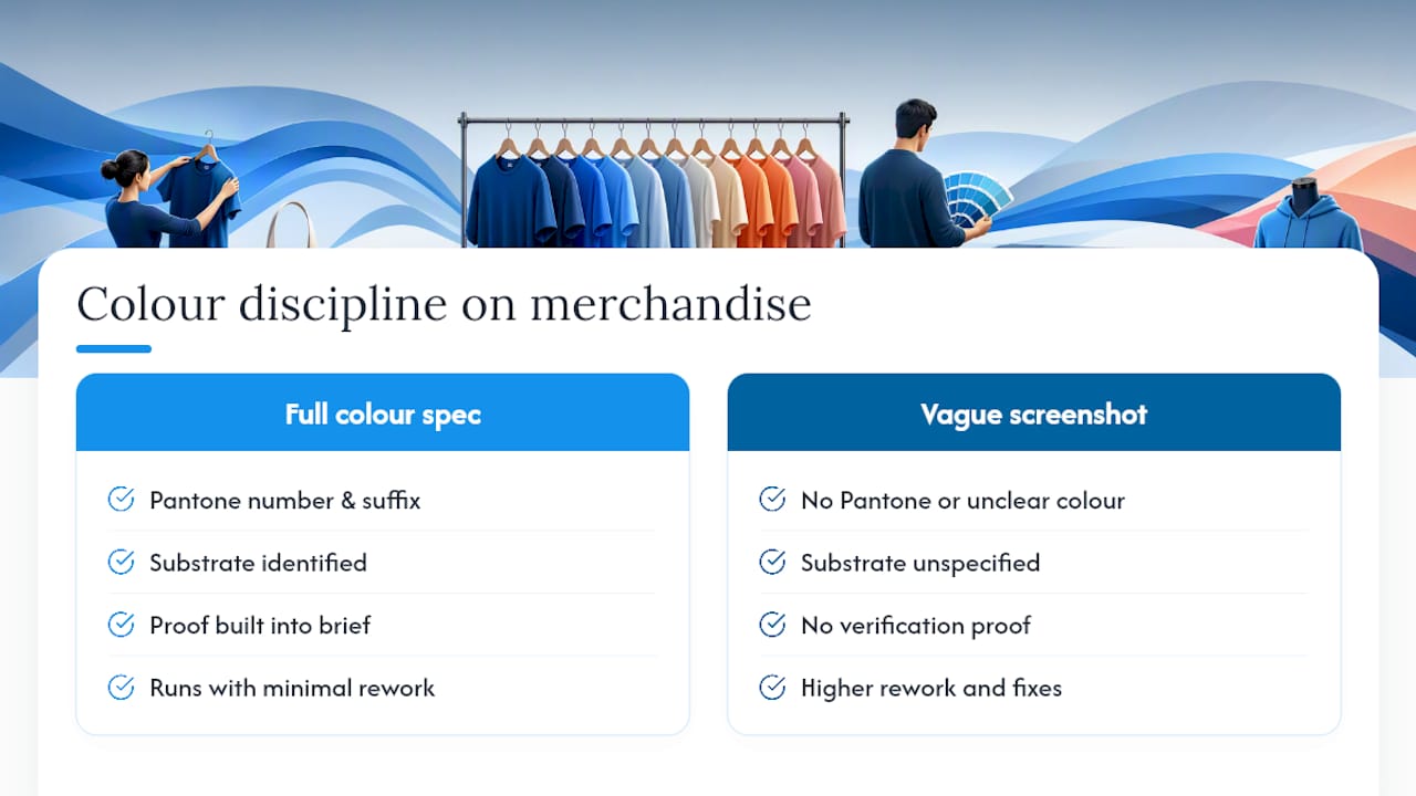
Getting Pantone matching right isn’t a design nicety, it’s the difference between a branded order that lands and one that comes back for a costly reprint. Over more than 25 years supplying branded merchandise, the pattern is consistent: jobs that specify the full colour spec upfront, number, suffix, substrate and proof, run through production with far less rework than jobs that hand over a vague screenshot and hope.
Fabric dye lots, coating finishes and substrate texture all pull a colour slightly off what looked perfect on a monitor. Building the verification step into the brief, not as an afterthought, is what actually saves reprints and wasted stock.
— SEO
Getting Pantone-accurate merchandise made without the guesswork
Getting a spot colour or CMYK build production ready is exactly where a lot of merchandise orders go sideways, and it’s where Promoshop’s approach pays off. Every order includes free artwork design, so instead of guessing at a Pantone suffix yourself, our team works the full spec, number, suffix, substrate and finish, into the artwork before it goes anywhere near a printer.
You can request colour tolerances and a proof on the actual substrate before committing to a full run, whether that’s a Tritan Bottle, a Quencher Bottle, a Compton 700mL Bottle, Resort Bag Tags, Corporate Bag Tags, a Tin of Tees, an Aqua Dry Bag, 10 litre, or a Premium Leather Valuables Pouch. When your deadline is tight, our Express Service gets a proof back to you fast enough to still hit your launch date. Browse the full product range and get a quote with your Pantone spec attached, we’ll confirm the match before a single unit goes into production.
Where to check the technical detail yourself
For device compatibility and feature breakdowns, go straight to Pantone Connect, the Pantone Color Finder, and Adobe’s note on spot versus process colour. Pantone’s own Connect free versus Premium guidance covers exactly what each tier unlocks.
Sources
- Can I use Pantone Connect for free? — Pantone support
- Pantone Color Finder — Pantone
- Spot vs process colour — Adobe
FAQ
How Can I Match a Pantone Colour?
Identify a candidate using Pantone Connect or the Color Finder from your file’s RGB, HEX or CMYK value, then verify that candidate against a physical Pantone guide under standard lighting. Never approve a final colour from a screen alone, the physical standard and an agreed proof are what govern production.
Is There a Pantone App for Colour Matching?
Yes, Pantone Connect is Pantone’s official app, and the free Basic tier includes search, pick and measure tools plus access to over 15,000 colours. Premium adds Adobe plugin integration for designers working directly in Illustrator or Photoshop.
How Do I Find My Pantone Colour Code?
Open the original artwork file, select the exact swatch, and check its colour space value, then run that value through Pantone Connect or the Color Finder to generate matching candidate numbers. For physical objects, the Pantone Color Match Card paired with the Connect app can suggest a code, but treat it as a starting point requiring physical verification.
Can I Use Pantone Colours for Free?
Pantone Connect Basic is free after creating an account, giving you access to more than 15,000 colours along with search, pick and measure tools. Full Adobe integration and advanced conversion tools require the Premium tier, and production approval still needs a physical guide or proof regardless of which tier you use.