
September 27, 2026
For most promotional items, left chest works best for subtle branding and full front works best for event impact. Size to the printable area: small marks sit around 10 to 12mm for chest embroidery, while large front prints run 25 to 35cm. Always confirm decoration method limits with your supplier and ask for a template before you order.
TL;DR:
- Embroidery on caps is best kept within 10cm by 6cm to prevent blurred or illegible detail, while full-front prints should be 25 to 35cm wide for visibility.
- Use a minimum logo size of 12mm for clear reproduction, with at least 15% of logo height as clear space to prevent crowding or distortion.
- Confirm decoration method limits and request templates and proofs from suppliers to avoid reprints caused by placement or sizing errors.
- Contrast, simplicity, and correct sizing are essential for digital and physical assets to ensure accessibility and legibility for all viewers.
- Different surfaces and products require tailored size and placement guidelines, with embroidery suited for small areas and screen printing for large, flat surfaces.
Table of Contents
- 1. Apparel placements and standard sizes
- 2. Best spots and size limits for caps, bags, drinkware and pens
- 3. Sizing, clear space and legibility rules
- 4. How decoration methods limit placement and size
- 5. Preparing artwork so it reproduces correctly
- 6. Quick ordering checklist and copyable specs
- 7. Logo placement on digital media and websites
- 8. Cultural context and market considerations
- 9. Accessibility considerations for logo size and placement
- 10. Examples of poor logo placement and their impact
- 11. Brand consistency monitoring and enforcement
- 12. Why consistent placement and clear briefs cut reprints
- How PromoShop can help with placement and artwork
- Sources
- FAQ
1. Apparel placements and standard sizes
Choosing the right spot on a t-shirt, polo, hoodie or jacket depends on how the item will be worn and how the logo will be applied. Left chest is the most requested placement for embroidery, and it works because the panel is flat, stable and easy to hoop. A typical left-chest logo sits around 10 to 15cm wide, keeping detail simple so the stitching stays crisp.
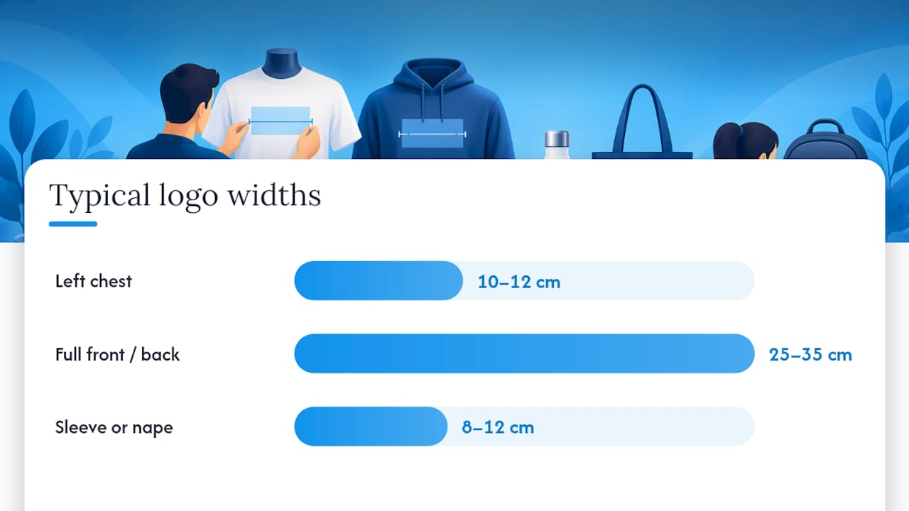
Full-front prints suit event tees, festival merchandise and any shirt meant to be seen from a distance. These designs commonly run 25 to 35cm wide, centred between the collar and the hem. Back prints follow a similar size range and work well on uniforms or crew shirts where visibility matters more than subtlety.
Sleeve and nape placements suit smaller marks, generally 8 to 12cm, and they’re a good fit when you want a brand present without dominating the garment. Polos and structured work shirts need smaller, simpler artwork too, since heavier fabric and seams can cause puckering under dense embroidery.
- Left chest: around 10 to 12cm wide, best for embroidery and everyday uniforms.
- Full front or back: 25 to 35cm wide, best for event shirts and high-visibility branding.
- Sleeve or nape: 8 to 12cm, best for a secondary or understated mark.
When in doubt, start with left chest. It’s the safest default across polos, tees and jackets, and it almost never runs into fabric or seam issues.
2. Best spots and size limits for caps, bags, drinkware and pens
Curved and small surfaces need different rules than flat garments. Getting the size wrong on a cap or a pen is one of the fastest ways to end up with a blurry or illegible mark.
- Caps: the front panel usually takes embroidery around 10cm by 6cm; use the side or rear panels for a second, smaller mark.
- Tote bags and backpacks: front-panel prints are centred and sized to the panel, with typical widths matching the bag’s usable flat area.
- Mugs and drinkware: a print height of around 80 to 90mm is standard for a single-side mark, with wrap prints used when the design needs to read from any angle.
- Pens: the printable barrel length is typically 30 to 60mm, so keep artwork to a single high-contrast colour for legibility.
The common thread across all four is contrast and simplicity. A cap embroidered with a fine gradient will lose detail at 10cm by 6cm, and a pen printed with a busy multi-colour logo will look muddy at 40mm. Match the artwork’s complexity to the size of the surface, not the other way around.
3. Sizing, clear space and legibility rules
Before you send artwork to production, run it through a few checks that catch most reprint causes early.
- Set a minimum size. Brand guidelines often specify a minimum reproduction width; ACEM’s own guideline sets this at 12mm, which is a useful benchmark for any small mark on merchandise.
- Apply a clear-space rule. Keep empty space around the logo proportional to its height. Apex Australia’s branding guide uses 15% of logo height as its clear-space rule, so a 40mm logo needs about 6mm of breathing room on every side.
- Check contrast and stroke weight. Thin lines and fine detail disappear below minimum size, so simplify before you shrink.
- Test single-colour reversals. If the logo needs to sit on a dark background, confirm the reversed version still reads clearly.
- Scale co-branded logos proportionally. When two or more logos share a panel, size them by sponsorship priority rather than making every mark the same size.
Pro Tip: Print a test version of your logo at its final size on paper and hold it at arm’s length. If you can’t read it clearly, it’s too small for the garment.
These checks take a few minutes but they’re the difference between artwork that reproduces cleanly and artwork that comes back blurred, cracked or unreadable after the first wash.
4. How decoration methods limit placement and size
The printing or stitching method you choose decides what placements and sizes are actually achievable, not just what looks good on screen.
- Embroidery suits small, single-colour or limited-colour marks. Stitch density has a practical ceiling, so very fine detail or tiny text won’t reproduce cleanly, and there’s a maximum workable area for caps and chest panels.
- Screen printing and DTG (direct-to-garment) handle larger, flatter areas well, which makes them the go-to methods for full-front and back designs, but seams, fabric weight and ink coverage all affect how the finished print looks.
- Vinyl or heat transfer works well for single-colour designs or specialty finishes like metallic or reflective logos, though the material can feel stiffer on the garment. Placement is limited by the size of the heat press and by nearby seams.
- Sublimation allows all-over, edge-to-edge designs but only on polyester or poly-coated materials, which restricts which products it can be used on.
Knowing these limits before you finalise placement saves a round of revisions. A logo designed for full sublimation coverage won’t translate to embroidery without simplification, and a detailed multi-colour design won’t survive a small embroidered cap panel. For a closer look at how each method works, see PromoShop’s printing options.
5. Preparing artwork so it reproduces correctly
Good placement decisions only pay off if the artwork file itself is production-ready.
- File types: supply logos as vector files (EPS, AI or PDF) wherever possible; if you only have a raster file, provide PNG or TIFF at 300 dpi at final print size.
- Colour modes: give Pantone or spot colours for screen printing, and CMYK for digital printing; avoid supplying RGB files for production, as colours can shift on press.
- Embroidery files: provide a simplified vector version and note thread colours or stitch direction if you have a preference.
- Templates and proofs: always request the supplier’s product template or dieline, and ask for a digital or physical proof before the full run goes to production.
Skipping the proof step is where most placement mistakes slip through. A quick check against a template catches sizing and colour issues before they become a reprint.
6. Quick ordering checklist and copyable specs
Before you request a quote, run through this checklist: product, placement, size in millimetres, colour mode, file type, whether a proof is required, and who approves the final artwork.
For common items, these are useful starting specs to paste into an order form:
| Product | Placement | Size |
|---|---|---|
| T-shirt | Left chest | 80 to 90mm |
| T-shirt | Full front | 25 to 35cm wide |
| Cap | Front panel | 80 to 90mm by 60mm |
| Mug | Side print | 80mm height |
| Pen | Barrel print | 50mm by 6mm |
Treat these as a starting point rather than a fixed rule, and always confirm setup costs and minimum order quantities with your supplier before locking in a size.
7. Logo placement on digital media and websites
Physical merchandise and digital assets follow different rules, but the same underlying logic applies: the logo needs to be legible at the size it will actually be seen. On a website, the logo typically sits top left of the header, sized to remain crisp at both desktop and mobile widths, usually somewhere between 120 and 200 pixels wide for a header lockup.
Favicons and app icons need a simplified version of the logo, since fine detail disappears at 16 by 16 or 32 by 32 pixels. Social media profile images crop to a circle or square on most platforms, so any logo with important detail near the edges risks being cut off.
Email signatures and digital ads follow similar sizing logic to print, just measured in pixels rather than millimetres: keep the mark simple, keep clear space around it, and test how it looks against both light and dark backgrounds before publishing. The consistent thread from print to digital is that a logo designed for one context rarely transfers cleanly to another without some adjustment to detail level and clear space.
8. Cultural context and market considerations
A logo that reads clearly in one market can carry unintended meaning in another, so placement and colour choices deserve a second look when merchandise is headed to a different audience. Colour associations shift between cultures: a colour that signals celebration in one market can signal mourning or caution in another, which matters when you’re choosing a background for a branded item.
Text direction matters too. Logos paired with text in languages read right to left need mirrored layouts, and any tagline translated for a new market should be checked by a native speaker rather than assumed to fit the same visual space as the original.
Placement conventions also vary by product category and region, so what counts as the “standard” chest position for a polo shirt in one market might sit differently on garments cut for another. When ordering merchandise for a market you’re less familiar with, it’s worth asking your supplier whether the placement and sizing you’ve chosen is standard practice there or whether it needs adjusting.
9. Accessibility considerations for logo size and placement
Legibility isn’t just a production concern, it’s an accessibility one. A logo that’s too small, too detailed or too low in contrast excludes readers with low vision, colour blindness or age-related vision changes, and that applies just as much to a mug print as it does to a website header.
Contrast is the simplest lever to pull. A logo in a mid-tone colour on a similar background will be hard to read for many people, so testing against both light and dark surfaces before production catches most problems early. Colour blindness affects how certain colour combinations are perceived, so relying on colour alone to distinguish parts of a logo, such as red and green side by side, risks the design losing meaning for some viewers.
Size ties directly back to the minimum reproduction rules covered earlier: a mark that drops below its minimum legible size isn’t just a print quality issue, it’s a barrier to someone reading it clearly at all. Simple, high-contrast, appropriately sized logos serve every reader better, whether they’re looking at a cap embroidered at 10cm or a website favicon at 32 pixels.
10. Examples of poor logo placement and their impact
Some placement mistakes show up immediately, others only become obvious after the merchandise has already shipped.
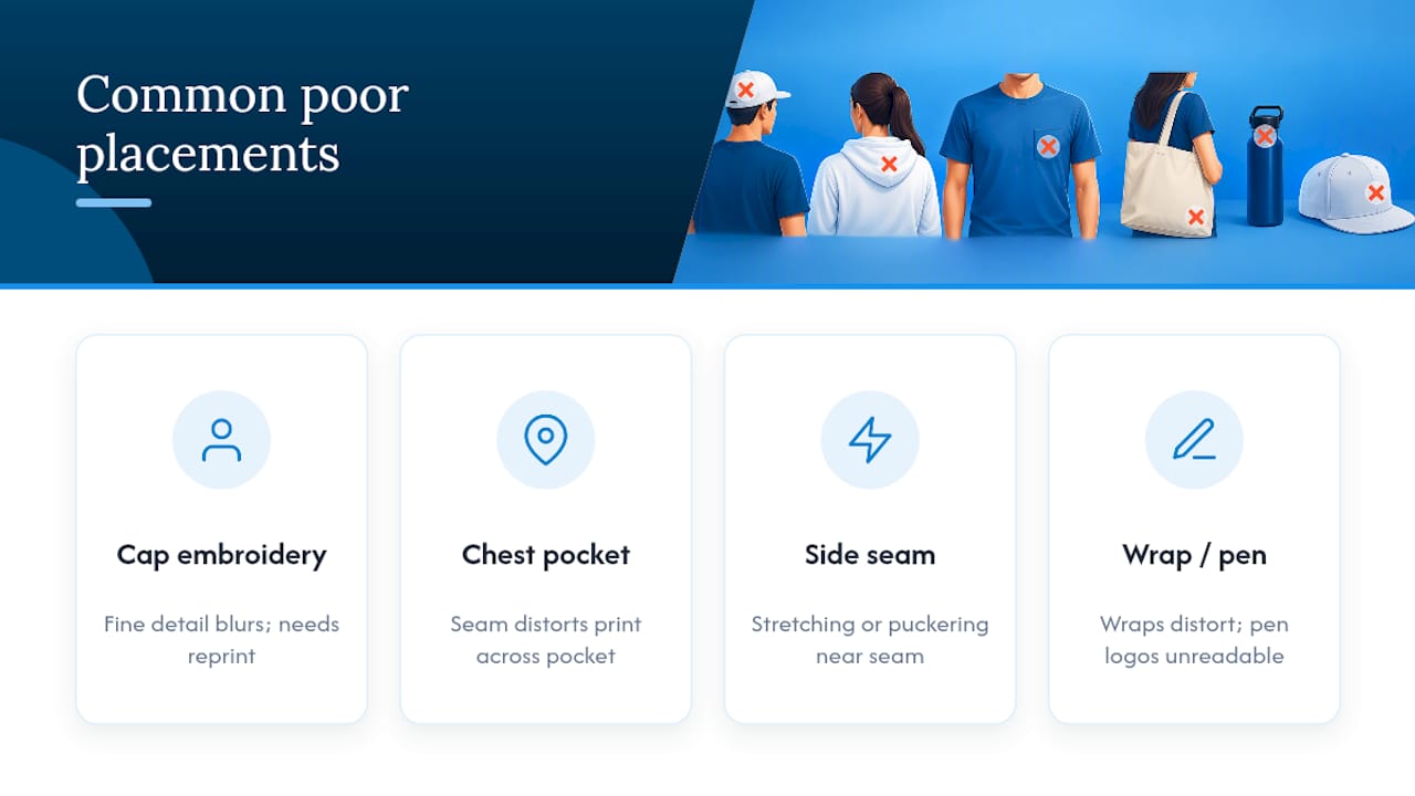
A full-colour, fine-detail logo embroidered onto a small cap panel is one of the most common failures. The stitching can’t hold the detail, so the result reads as a blurry mark instead of a clean logo, and the whole order needs reprinting.
A large full-front design placed on a garment with a chest pocket is another frequent issue: the seam interrupts the print and distorts the design where it crosses the pocket line. Placing a logo too close to a side seam on a t-shirt causes similar problems, with the print stretching or puckering when the garment is worn.
On drinkware, a wrap print sized for a mug applied to a slimmer bottle without adjusting for the different curve leads to a distorted, stretched-looking result. And on pens, a multi-colour logo squeezed into a 50mm by 6mm barrel print often loses so much detail that it’s unreadable at arm’s length.
The impact goes beyond the individual item. Poorly placed or blurred logos on giveaway merchandise reflect on the brand itself, and a batch of items that need reprinting adds cost and delay to an order that should have been straightforward. Getting the placement and size right the first time avoids all of it.
11. Brand consistency monitoring and enforcement
Keeping a logo consistent across every product a business orders is an ongoing job, not a one-off decision made at the first order. Most organisations that maintain brand guidelines, including the examples referenced earlier in this guide, set out rules for approved colour variants, minimum sizes and clear space specifically so that anyone ordering merchandise later has a reference to check against, rather than guessing.
In practice, that means keeping one master artwork file rather than letting each department source or recreate the logo independently, since small variations creep in every time a logo is redrawn or resized by hand. It also means having a single point of approval for new merchandise orders, someone who checks new artwork against the brand guideline before it goes to print.
For businesses ordering across multiple product types, from t-shirts to pens to drinkware, a short internal reference sheet listing approved placements and minimum sizes for each product type saves time on every future order and reduces the chance of an inconsistent placement slipping through. PromoShop’s own branding guide is a useful example of how this kind of reference can be structured for a growing product range.
12. Why consistent placement and clear briefs cut reprints
Most reprint requests trace back to a placement or size decision made without checking the decoration method’s limits first. PromoShop has worked across branded merchandise for over 25 years, combining a trusted global supply chain with factory-direct sourcing to keep quality consistent order after order.
The pattern holds regardless of product: confirm the printable area, size to it, and proof before the full run. That single habit prevents more reprints than any design change ever will.
— SEO
How PromoShop can help with placement and artwork
Getting placement and sizing right on paper is one thing, seeing it on the actual product before committing to a full run is another. PromoShop’s free artwork design service checks your logo against the chosen product’s printable area and decoration method before anything goes into production, so sizing issues get caught early rather than after delivery.
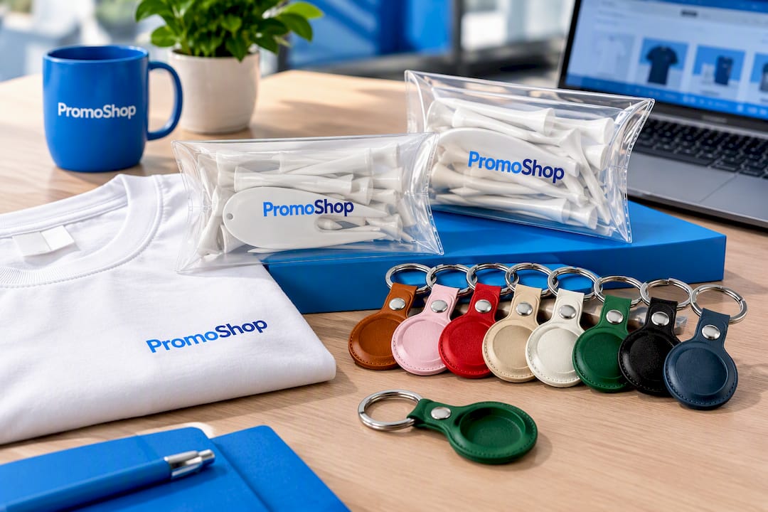
If you’re planning event shirts, a Pillow Pack Standard Tee Pack or a Pillow Pack 55mm Tees order gives you a simple starting point for full-front or left-chest branding. For smaller corporate gifts, the PU Leather AirTag Holder with Keyring is a compact item worth checking against the sizing rules above.
- Request a product template before finalising your artwork size.
- Ask for a proof, digital or physical, before the full order goes to print.
- Get a quote with your placement and size specs already confirmed.
Request a quote and PromoShop’s team will check your placement and sizing against the product before production starts.
Sources
- What is Imprint Area? – What’s its Importance in Custom Garment Printing?
- What is the Imprint Area? A Complete Guide for Custom Printing
- ACEM logo guidelines (COR443)
- Apex Australia branding guide
FAQ
What is the standard size for a left chest logo?
A left chest logo is typically 10 to 15cm wide for embroidery, kept simple in detail so the stitching stays clean. This is the most common placement for polos, uniforms and everyday branded apparel.
How much clear space should surround a logo?
Clear space is usually set as a percentage of the logo’s height rather than a fixed measurement. Apex Australia’s branding guide uses 15% of logo height, so a 40mm-tall logo needs roughly 6mm of clear space on each side.
What is the minimum size a logo can be reproduced at?
Minimum sizes vary by brand, but ACEM’s guideline sets 12mm as its minimum logo width. Anything smaller risks losing fine detail and becoming illegible, especially on embroidery.
Which file type should I supply for a logo?
Vector files such as EPS, AI or PDF are preferred because they scale cleanly to any size without losing quality. If only a raster file is available, it should be at least 300 dpi at the final print size.
Why does decoration method affect where I can place a logo?
Each method has physical limits: embroidery struggles with fine detail and very small text, while screen printing and DTG suit larger, flatter areas but are affected by seams and fabric weight. Checking these limits with your printing options before finalising artwork avoids reprints and mismatched sizing.