
September 26, 2026
Use these size ranges as your starting point: left chest 8–10 cm (3–4 in), centre chest 15–25 cm (6–10 in), full front or full back 25–30 cm (10–12 in), and sleeve prints 5–10 cm (2–4 in). Back collar logos sit smaller again, around 5–8 cm. Supply your artwork at that exact final print size, as a vector file or a 300 dpi raster, and you’ll avoid nearly every sizing headache that trips up first-time orders.
TL;DR:
- Logos on left or right chest should be 8 to 10 cm wide to maintain a tidy, professional appearance without overpowering the garment.
- Center chest logos typically range from 15 to 25 cm in width, with larger sizes suited for high-visibility styles like team or event shirts.
- A logo’s vertical placement is ideal when the top aligns about 7 to 9 cm below the collar seam, ensuring balanced visual proportion.
- Variations in garment size, fabric, and colour require scaling adjustments of roughly 10 to 20 percent for youth and women’s apparel to retain visual consistency.
- Providing artwork at the final print size, in vector or 300 dpi raster format, and verifying placement with physical samples helps prevent common sizing and alignment errors.
Table of Contents
- What is the right logo size on shirts for each placement?
- How far down should a logo sit from the collar?
- Do I need different logo sizes for youth, women’s, and big sizes?
- What file format and resolution do you need for accurate printing?
- How does the printing method change your logo’s size and detail?
- Does fabric type and colour change how big a logo should be?
- What makes a logo size accessible and easy to read?
- What are the most common logo sizing mistakes?
- How do different industries size logos on their shirts?
- What experienced printers check before sizing a logo
- Get your sizing right the first time with Promoshop
- Templates and specs worth bookmarking
- Sources
- FAQ
What is the right logo size on shirts for each placement?
Every placement on a shirt has a size range that print shops treat as the default, because it’s what actually looks right on a folded, worn garment rather than a flat screen. Get the placement wrong and even a beautifully designed logo looks like an afterthought.
Left and right chest positions call for a compact 8–10 cm (3–4 in) width. This is where most corporate uniforms and polo shirts put a logo, and the small scale keeps things looking tidy rather than shouty. Centre chest gives you more room to move, from 15–25 cm (6–10 in), and where you land in that range depends on how bold you want the statement to read. A subtle wordmark on a premium tee sits closer to 15 cm; a graphic-heavy streetwear design pushes toward 25 cm.
Full front and full back designs are the biggest canvas on the garment, typically 25–30 cm (10–12 in) wide, and some oversized print styles go larger again. Sleeves stay modest at 5–10 cm (2–4 in), enough for a small brand mark or event date without crowding the seam. Back collar placements, often used for a subtle “made by” tag, run 5–8 cm (2–3 in).
As a rule, push toward the larger end of each range for team shirts, event merchandise, and anything meant to be read from a distance. Keep to the smaller end for corporate uniforms, client-facing apparel, or anywhere a discreet brand presence matters more than visibility.
| Placement | Width (cm) | Width (inches) |
|---|---|---|
| Left/right chest | 8–10 cm | 3–4 in |
| Centre chest | 15–25 cm | 6–10 in |
| Full front/back | 25–30 cm | 10–12 in |
| Sleeve | 5–10 cm | 2–4 in |
| Back collar | 5–8 cm | 2–3 in |
How far down should a logo sit from the collar?
Placement distance matters as much as width. A logo that’s the correct size but sits too high or too low still reads as a mistake, and it’s one of the most common errors printers see in customer-supplied files.
For centre-chest designs on adult shirts, position the top of the logo 7–9 cm (roughly 3–3.5 in) below the collar seam, measured from the base of the neckline rather than the shoulder. This lines up with what most beginner sizing guides recommend, and it puts the design in the visual centre of the chest without crowding the collar.
Left-chest logos follow a slightly different rule of thumb:
- Sit roughly 6–8 cm down from the collar seam.
- Offset 5–7 cm from the shirt’s centreline, adjusting for logo width.
- Keep the same vertical position across all sizes in a run, even though the horizontal offset may shift slightly on larger cuts.
- Check alignment against the shoulder seam, not just the collar, on raglan or athletic styles.
For full-front or full-back designs, align the artwork to the garment’s actual centreline rather than eyeballing it, and account for side seams so the print doesn’t drift off-centre on curved cuts. The simplest way to check placement on a physical garment is to lay it flat, fold it in half vertically, and mark the centre crease before measuring outward.
Pro Tip: Digital mockup tools are great for approvals, but they don’t always reflect how fabric drapes once worn. If you’re trying a new placement or an unusually large print for the first time, request a physical sample before committing to a full run.
Do I need different logo sizes for youth, women’s, and big sizes?
A logo sized correctly for a men’s large will often look oversized on a youth medium and slightly cramped on a women’s fitted cut. Garment proportions change more than most people expect between sizes, and scaling your artwork to match keeps the branding looking intentional rather than stretched or shrunk to fit.
- For youth and children’s sizes, reduce chest logo dimensions by roughly 10–20% compared with the adult version.
- For smaller adult sizes (extra small, small), trim centre-chest width by 1–2 cm if the standard size looks disproportionate on a narrower chest panel.
- Women’s fitted cuts and slim-fit styles often need a narrower placement zone; consider a slightly taller, narrower logo variant rather than simply shrinking the original.
- Big and tall sizes can usually handle the standard adult sizing without adjustment, since the chest panel scales up proportionally.
One scalable vector file is often enough to cover a size range, since it resizes cleanly without quality loss. Multiple size-specific artboards become worthwhile when a design has fine text or detailed linework that needs to stay legible at the smallest size in the run, such as a rugby performance shirt ordered across youth and adult sizing.
What file format and resolution do you need for accurate printing?
Printers reproduce your file at the physical dimensions it’s supplied in, not at whatever size looks right on screen. Send a logo file sized at 10 cm wide, and it prints at 10 cm wide, regardless of what the design looked like zoomed in on your monitor. This single point trips up more first-time orders than any other artwork issue.
Follow this sequence when preparing files for print:
- Decide your final print dimensions in centimetres before you touch the artwork.
- Export raster files (JPG, PNG) at 300 dpi at that exact print size, and export vector files (PDF, EPS, or SVG) wherever the design allows, since vector formats hold sharp edges at any scale.
- Trim any transparent canvas around the design and remove unnecessary bleed so the printer isn’t left guessing the true dimensions.
- Name the file with its intended print size (e.g. “logo_20x15cm.pdf”) to avoid ambiguity during production.
- Check the maximum printable area with your printer before finalising a full-front or oversized design.
Standard print areas typically max out near 40 cm by 50 cm, and going beyond that generally triggers an oversize surcharge charged per square centimetre. If your design is pushing those limits, it’s worth confirming pricing before you lock in the file.
How does the printing method change your logo’s size and detail?
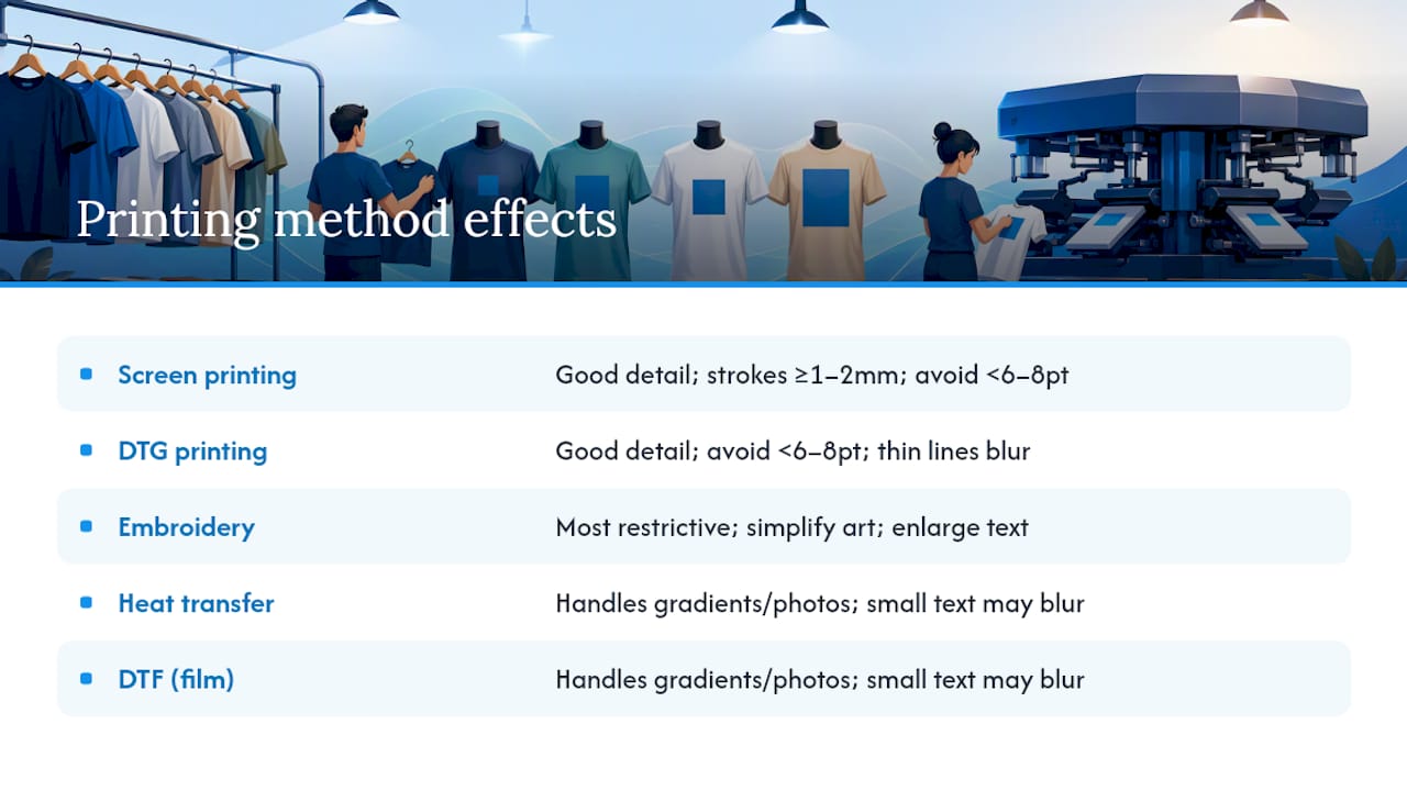
The printing method you choose shapes how small or detailed a logo can go before it starts to lose clarity. Design the same logo for screen printing and embroidery, and you’ll likely need two different versions.
Screen printing and direct-to-garment (DTG) printing both handle fine detail reasonably well, but thin lines and small text can still bleed or blur at small sizes. Keep stroke widths above roughly 1–2 mm for screen printing, and avoid text smaller than 6–8 points wherever legibility matters.
Embroidery is the most restrictive method. Fine detail, thin serif fonts, and tight gradients don’t translate to stitches, so simplified artwork with bolder shapes reproduces far more reliably. Embroidered logos generally need a slightly larger minimum width than a printed equivalent, and small text often needs enlarging or converting to a simplified mark altogether. Large embroidered back panels typically use satin or fill stitching rather than fine outline work.
Heat transfer and DTF (direct-to-film) handle gradients and photographic detail well, but small text can still lose sharpness at reduced sizes. Explore the different printing options available before finalising your artwork, since the right method depends as much on your design’s detail level as on the garment itself.
Pro Tip: If you’re unsure how a design will translate to embroidery, ask for a stitched sample before committing to a full production run. It’s the fastest way to catch legibility issues before they show up on fifty shirts instead of one.
Does fabric type and colour change how big a logo should be?
Fabric texture and colour don’t change the physical dimensions of your logo file, but they change how large that logo appears once printed, and that perceptual shift matters when you’re deciding on final sizing.
Textured fabrics like pique polos, ribbed knits, or heavyweight fleece absorb more visual detail into the weave.
Colour contrast plays an even bigger role. A dark logo on a light shirt, or vice versa, reads larger and bolder than the same logo in a low-contrast colourway, purely because of how the eye processes edges. A navy logo on white cotton will look more prominent than an identical-sized navy logo on charcoal grey, even though the physical dimensions haven’t changed at all.
Print method interacts with fabric colour too. Screen printing on dark garments usually needs an underbase layer, which can slightly soften fine detail compared with the same design on a light shirt. DTF and heat transfer generally hold detail more consistently across colours, since the print sits on top of the fabric rather than absorbing into it.
When you’re choosing a final size, view your mockup against the actual garment colour and fabric, not just a white background proof. A logo that looks perfectly proportioned on a flat white template can read differently once it’s sitting on the heathered grey tee your team actually ordered.
What makes a logo size accessible and easy to read?
Readability isn’t just a design nicety. A logo that’s technically the “correct” size on paper can still fail if the details are too fine to register at a glance, and that matters more on apparel than almost anywhere else because people view shirts from a distance and at odd angles.
Contrast is the first lever. Aim for a strong tonal difference between the logo and the shirt colour rather than relying on subtle shade variations that wash out under different lighting. A logo that works beautifully on a lightbox often disappears on fabric under fluorescent office lighting or outdoor sun.
Line weight matters just as much as overall size. Thin strokes or fine serif text can technically fit within a small logo footprint, but they blur or vanish once printed, particularly with embroidery or heavily textured fabric. As a working rule, if you can’t read the smallest text clearly at arm’s length on a printed proof, it’s too small or too fine for the garment.
Simplify before you shrink. If a logo needs to go smaller than its ideal range for a particular placement, such as a sleeve or back collar mark, simplify the design first rather than just scaling down the full detailed version. Drop secondary taglines, thicken thin strokes, and keep only the elements that still communicate the brand at a reduced size.
Spacing around the logo also affects legibility. A design crammed right up against a seam or collar edge reads as cluttered, even if the logo itself is correctly sized. Leave breathing room, especially on smaller placements where every millimetre of clear space helps the eye separate the logo from the garment.
What are the most common logo sizing mistakes?
Most sizing problems trace back to a handful of repeat mistakes, and they’re avoidable once you know what to check before submitting artwork.
Supplying a file at screen resolution rather than print size is the most frequent error. A logo that looks sharp at 72 dpi on a laptop screen can be wildly undersized or pixelated once scaled to an actual 20 cm print, because screen resolution and print resolution aren’t the same measurement at all.
Ignoring the garment’s actual proportions is another common slip. Designers often size a logo against a flat template without accounting for how the fabric folds, how the chest curves, or where the side seams sit on the finished garment. What looks centred on a digital mockup can sit visibly off to one side once the shirt is worn.
Scaling one master file across every garment size without adjustment causes problems too. A centre-chest logo sized for an adult large can look oversized and cramped on a youth small if nobody adjusted the dimensions down for the smaller chest panel.
Choosing a print method after finalising the design, rather than before, leads to detail that simply won’t reproduce. Fine gradients designed for DTF often fail badly if the order later shifts to embroidery, because the two methods have completely different minimum detail thresholds.
Finally, skipping a physical sample for a new placement or an unusually large print is a mistake that only shows up once fifty shirts have already been printed. A five-minute sample check catches sizing and placement issues that no digital mockup will reveal.
How do different industries size logos on their shirts?
Sizing conventions shift depending on what the shirt is for, and looking at how different industries approach it makes the general rules easier to apply to your own project.
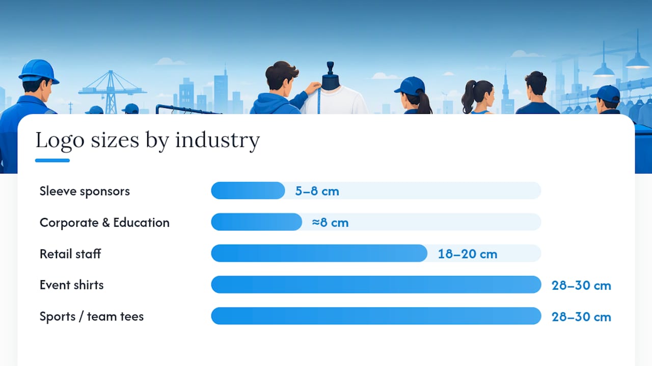
Corporate uniform programs almost always favour the smaller end of the left-chest range, typically around 8 cm, paired with a discreet colour palette. The goal is professional consistency across a workforce, not visual impact, so oversized branding actually undermines the intended effect. Education-sector apparel follows a similar logic, keeping school crests compact and consistent across every uniform size in the order.
Sports and team merchandise sit at the opposite end. Full-front designs at 28 to 30 cm are common for supporter tees and event shirts, because the whole point is visibility from a distance, whether that’s a crowd at a match or a fun run. Sleeve placements in this category often carry sponsor logos, using the smaller 5 to 8 cm range to fit multiple marks without cluttering the design, an approach also seen in printed golf merchandise where club badges need to stay legible at a small scale.
Event and hospitality shirts, the kind used for festivals, buckets parties, and staff uniforms at a one-off function, tend to favour bold centre-chest or full-front graphics toward the upper size range, since the shirts are often the only branding touchpoint for a single day, and pricing for event runs frequently scales with print size and complexity.
Retail and hospitality staff uniforms usually split the difference, using a mid-range centre chest logo around 18 to 20 cm that stays visible to customers without dominating the garment.
What experienced printers check before sizing a logo
The shortcuts that save the most rework: mock the design up at 100% physical scale before approving anything, always supply logos as vector files where the artwork allows it, and request a physical sample whenever you’re trying a new placement or an unusually large print for the first time.
Costs shift once a design pushes past standard print area maximums, and that’s worth factoring into your design brief early rather than after a quote comes back higher than expected. Over many years sourcing and printing branded apparel, most sizing disputes come down to one of these three checks being skipped, not a flaw in the design itself.
— SEO
Get your sizing right the first time with Promoshop
Getting logo dimensions right on paper is one thing. Getting them right on the actual shirt, in the actual colour, at the actual print size, is where most DIY orders go sideways. Promoshop removes that guesswork with free artwork design support, so a specialist checks your file’s scale, resolution, and placement before it ever hits production, backed by a price beat guarantee and fast turnaround when you’re working to a deadline.
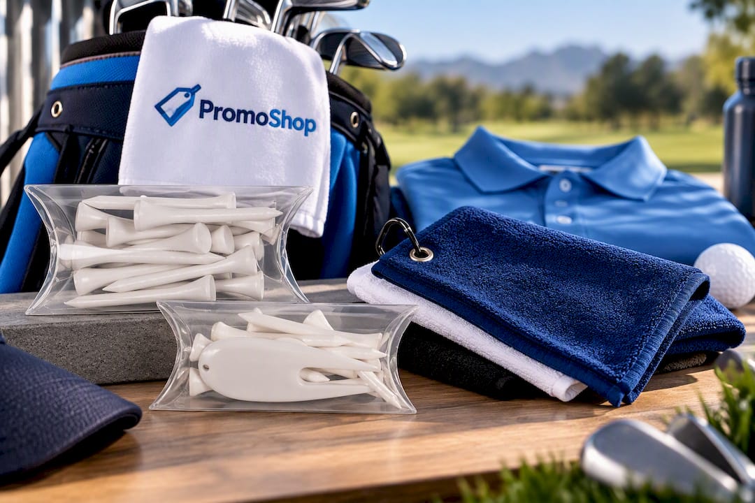
Whether you’re ordering a small trial run through the Pillow Pack – Standard Tee Pack, testing a compact logo on a Pillow Pack – 55mm Tees, or branding a non-apparel item like a Small Golf Towel for an event giveaway, the same sizing principles apply, and Promoshop’s team checks them for you before anything prints. Request a proof, confirm your final dimensions against the garment you’ve chosen, and approve production once you’re happy with how it sits.
Templates and specs worth bookmarking
For deeper artwork specs, the DropShirt artwork requirements page covers file formats, dpi rules, and print-area maximums in detail. The Printful placement guide offers useful placement diagrams, and the Purepack DTF size guide is a solid Australian reference for confirming standard size ranges before you finalise a design.
Sources
- A Beginner’s Guide to T-Shirt Logo Sizing and Placement
- Artwork Requirements | DropShirt Print on Demand
FAQ
What size should a logo be on a shirt?
It depends on placement: left or right chest logos typically run 8–10 cm (3–4 in) wide, centre chest sits between 15–25 cm (6–10 in), and full front or back designs run 25–30 cm (10–12 in). These ranges align with standard printer sizing guides used across most Australian apparel suppliers.
How far down should a logo sit on a shirt?
For centre-chest placements, position the top of the design roughly 7–9 cm below the collar seam, measured from the neckline. Left-chest logos typically sit 6–8 cm down from the collar, offset 5–7 cm from the shirt’s centreline.
What is a good size for a logo?
A good size depends on the placement and the level of visual impact you want. Smaller sizes around 8–10 cm suit discreet corporate branding on the chest, while bolder statement designs on the full front commonly reach 25–30 cm wide.
How big is a logo like Nike’s on a shirt?
Sports brand logos on the left chest typically fall within the standard 8–10 cm range used across the industry, keeping them recognisable without overwhelming the garment. The exact dimensions vary by product and season, but they generally sit at the compact end of the chest-logo scale rather than the larger centre-chest sizing.